

(quote)
For over a decade, the Twitter bird logo has been inseparable from the social media platform. But with the service’s X rebrand, Musk is saying goodbye to ‘all the birds.’
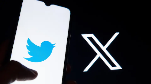
Early Monday morning, Twitter began replacing its blue bird logo with a fan-made “𝕏” logo. The same X also appears on Twitter’s homepage, as a profile picture for its official @twitter account, and on a splash screen displayed while the website loads. The blue bird logo hasn’t been expunged from the service entirely — it still serves as the website’s favicon and remains prominent throughout the mobile apps — but we’re now knee-deep in a haphazard rebranding that was announced by Elon Musk yesterday. “Soon we shall bid adieu to the twitter brand and, gradually, all the birds,” Musk wrote.
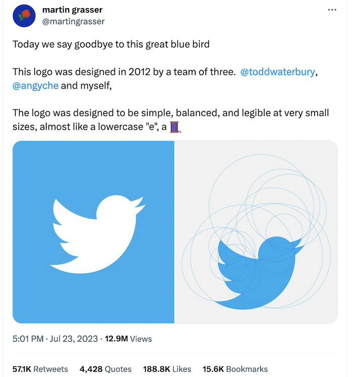
The modern Twitter bird was actually the company’s second logo and replaced the company’s earlier “Larry the Bird” logo it used between 2010 and 2012. The Twitter bird logo was designed by Martin Grasser alongside Todd Waterbury and Angy Che. The final design was one of 24 potential options presented to Jack Dorsey. Grasser previously told Fast Company that Twitter’s co-founder and former CEO picked it out almost immediately.
The logo itself was constructed from 15 overlaid circles, which Grasser has said helps with its legibility. “With a logo, something that small, you want repetitive shapes and forms,” Grasser told Fast Company. “It makes it easier for the human eye to understand, and it’s less cluttered.” The circles were also meant to symbolize Twitter’s aim of democratizing information and giving everyone a voice.
The Twitter bird was more than just a logo; it also dovetailed with the language used to describe the service. Calling posts “tweets” predated the first version of the bird logo by a couple of years, but now, the two seem fairly inseparable. Twitter is “the bird app,” and posts are “tweets” that you write by tapping a feather icon.
The new X logo, meanwhile, is… whatever. Musk has called it an “interim X logo,” which he suggests will be refined over time. It appears to have been picked from a design submitted by Sawyer Merritt, who says he based his submission on a font found online. It’s so generic that it appears almost identical to the Unicode character “Mathematical Double-Struck Capital X,” aka U+1D54F, aka “𝕏,” which is how Musk has been able to tweet the logo in an entirely text-based tweet. A neat trick for sure — but a damning indictment of how generic Twitter’s interim logo is.
“There was essentially no brief, other than we want a new bird, and it should be as good as the Apple and Nike logo. Twitter had made some sort of flying goose – but Jack wanted something simpler.” So, I just started drawing birds.Drawing is one of the quickest ways to understand how the shapes can work together…”
Finally, by 2012, the Twitter bird logo had become so well recognised that the company decided it could stand alone. It had reached the status of the Nike swoosh. The word ‘Twitter’ was removed from the logo, the blue colour was changed to #1da1f2 and the bird was refined by Martin Grasser in what was one of his first jobs after graduating from the Art Center College of Design.
Grasser is said to have drawn at least a thousand birds before achieving the proportions and simplicity he wanted. He sent Jack Dorsey 24 sketches, and Dorsey chose the winner (numbered ‘5CS’, apparently) without a moment’s hesitation. The Twitter logo design does not represent any specific bird, but Grasser has said it was inspired by a hummingbird beating its wings.
The shape is much more circular than a real bird – in fact, the design was formed by 15 circles superimposed in layers on top of each other, creating perfect curves in the beak, head, wings and chest. The bird is looking upwards, to represent hope, freedom and development, while the circles used to create it are said to represent connecting people and ideas.
(unquote)
Image courtesy @martingrasser


